Font You
So take all the craziness I just brought to talking about colour and kick it up a notch, and you now have how I feel about fonts.
I can only write using certain fonts. Everything having to do with Rachel Goldman is written in Garamond. I can only write about her in Garamond, single-spaced (it only gets put into double space when it leaves my hands to go to the agent or publisher). If computers ever stopped supporting the font Garamond, there would no longer be a Rachel Goldman.
The one exception is mapping for Rachel Goldman books (sketching out notes, scene by scene). Those all have to be done in American Typewriter.
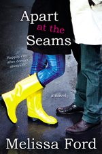
I recently started writing a new book — a paranormal romance — in Cambria. It felt like a Cambria sort of book at first. I got out the first thirty pages, and then decided to tweak the plotline, and with the tweak, I needed a new font. I’ve tabled it for the time being until I finish Apart at the Seams, but picking a new font will need to take place before I continue writing it.
This blog — Stirrup Queens — is written in Georgia. Georgia is totally fine, neither here nor there. It’s like water to me.
I like serifed fonts. I pretty much only like serifed fonts. They make me feel as if the word is complete. Sans-serifed fonts, such as Arial, make me feel as if the words are a little too naked. Not a freeing sort of naked, but more like forgetting-to-put-on-your-pants-and-then-driving-to-work naked. To me, it’s not an accident that sans-serifed fonts are sometimes called “grotesque” by typographers (fine, from “Grotesk”). I find them grotesque.
Let me explain how important fonts are to me: I would rather write a book on a typewriter with a serifed font than write a book on a computer with a sans-serifed font. I know part of the reason for the typewriter would also be that I like to hear clicks while I’m writing (I can’t use a “silent” keyboard). But the much larger part would be the font.
I love thinking about fonts and dissecting fonts, and I subscribe to a bunch of blogs that talk about nothing but fonts. I love words like spine and descender and crossbar. A good font make me happy. It’s like getting hot chocolate on a cold day: it invites you in. A good font invites the reader into a word, and if the words link together well, it invites the reader into a world.
I really care about the fonts other people use too. I like that most blog readers (such as Feedly), put all the posts into the same typeface. But I appreciate good fonts so much that I will leave Feedly and read the post on your site, even if I know that I can’t comment because I’m on my phone, just so I can see your font. A lot of times, I think of bloggers in terms of their font — part of how I process your personality comes from your font choice — and when you change your font, it throws me off. Massively.
On a scale from 1 to 10, with 1 being “I never notice fonts… what the hell are you talking about?” and 10 being “I can name all of my favourite fonts too” where do you fall in terms of font-love?




27 comments
As an illustration major, I love good fonts. Words are beautiful to look at when they have a nice font. One of the biggest beefs I have at work (I don’t have any REAL beefs, my job is awesome, my boss beyond awesome, pay is good) is that I have to make a lot of flyers, posters, signage, blah blah blah and my boss doesn’t ever want to use fonts with serifs for some reason, she says that they are hard to read. So I will bring a nice flyer to her for approval and she’ll say “I think it is hard to read”. I know she is going to say it, every time, but I won’t do it in Arial first.
I also love the word Serif. San Serif sounds like a hero in a bodice ripper novel. Maybe in a paranormal romance??? 😉
I LOVE fonts. And I can definitely name my favorites. But I’ve never had projects that could only happen in a certain font or were defined by a font. That is interesting.
I’m probably an 8 or so. I am a font-fan, and yes, I definitely notice fonts. I have certain fonts that are “stupid” fonts to me, and if I see someone using them, I honestly think less of them (Comic Sans is one that comes to mind…). I am an extremely visual person, but I don’t necessarily associate a person or event with certain fonts, like you do. I, rather, associate people, books, stories, events, etc. with a certain place. I have no idea why it’s like this for me, but for example, A Little Pregnant is associated with this one exact spot on the cloverleaf exit off of I-40 by the mall. Any time I read Julie’s blog, or read anything about Julie, my brain takes me to that exact physical spot.
But anyhow… yeah. Fonts are important, but I think about them more as ornamentation. I hate when people use too many different fonts on one item. And I don’t like it when people use a font with the wrong “personality” for what they are writing about. You can’t write about robots using some sort of scripted font. It doesn’t work.
I do, however, have to profess a love for certain serif-less fonts. For my wedding invitations, I insisted that we use some sort of very classic, very clean font, and it drove my mom crazy. She went to journalism school in the 60s and they were told that if they ever wanted to make it difficult for someone to edit something, they should use a sans serif font. She was really set that we had to use a more standard font, and I was set that we had to have a certain visual look. What can I say, except that the reception hall was NOT Times New Roman. It was sort of a Century Gothic or a Futura, maybe. I don’t know why it was, it just was, and I couldn’t use a font that didn’t match the “style” of the reception hall (apparently, I didn’t really care much about whether the font matched the location of the actual *wedding*… all about the priorities, I guess. Party on, people!).
I once bought a book on fonts and their histories to take to a Christmas gift exchange. I added a bottle of rum. My sister laughed at me and said I was the only person who care about fonts. I took the book home myself.
I also love love that there is a font to make dealing with text easier for people with dyslexia.
I do like good fonts and always pay attention to what fonts to use in letters/resumes etc. (I don’t mind san serif fonts though, although I will NEVER use Arial), but… I haven’t chosen a specific font for my blog. I just went with the standard serif blogger font, which I find okay – just like the template I use… It’s okay, it should be personalized, but I still haven’t done so (which is not okay)…
A company I worked for a long time ago dictated only 2 fonts to be used: Times New Roman and Arial. I’ve had to type in one or the other over a better part of a decade so I’ve lost the eye for different fonts.
I remember in college somebody using century gothic in size 13 to make a minimum required # of pages. The prof got wise as several of us started using the same. So we then had to turn in papers in no more than size 12 TNR or arial.
My favorite font is parchment. I usually have to download it and can only use it on my homemade calendars, but it’s still a kool font.
I’m gonna go with a 3. I rarely notice them. In fact, that number is only as high as it is because I really do loathe frilly, hard-to-read fonts. My only requirement is that I don’t have to squint. Otherwise, whether it’s Times New Roman or Garamond, I make a mental note of the font as I begin to read and promptly focus on the content. Maybe this is why I don;t have a ton of style: I’m missing some appreciation for visual elements.
I am obsessed with fonts. I have had the book Just My Type: A Book About Fonts on my amazon.com wish list forever. I love Arts & Crafts fonts, like Willow, the best. Sigh.
Put me down as a 3. I know when a font bothers me, like when it hinders me reading the material. Other than that? I don’t really have an opinion one way or the other for most reading. If it’s on a flyer, invitation, etc then I take a closer look.
I am an 8 or a 9. I LOVE fonts. I put Just My Type on hold at the library the moment it came out, and LOVED reading it. I am also a Serif kind of woman. I like the extra elements.
I do all of my academic writing in TNR, but mess around with e-mail fonts. And I definitely like to sit and mull and choose a font when I’m writing something not for university. I also love the notes in books about the font.
10!! Oh I love fonts!! I write my blog in Georgia too, it’s just comforting for me, Times New Roman use to be my favourite but Georgia took it’s place…I love scripts. My fav right now is Kunstler Script…mostly because the name makes me giggle but also because it’s pretty & it’s my go to fancy…I think I love fonts so much because I have autrocious hand writing & hate the way it looks.
OMG. You are my font soul-mate. I used to print fonts and hang them all over my desk in college. Garamond is my preferred writing font. Sometimes I need to look at things in sans-serif, but I can’t write in it. I wonder if it has to do with reading?
I am probably about a 6-7. I know about fonts & I enjoy playing around with them on certain projects (when I’m doing journaling for a scrapbooking project, for example), but for most everyday use, I go with good old Times New Roman, which is sort of the standard default font on every program I have at home & at work.
A former boss disliked Times Roman intensely & dictated that we must always use a sans serif font and preferably Arial. :p She’s gone now, but most people I work with now use Arial for everything. I don’t particularly like Arial, although Verdana & Calibri are growing on me. I have used Papyrus for my Christmas letters for the past several years… I was looking for a special font to use and that’s the one I liked best.
Dh only just recently figured out how to change the fonts, sizes & colours of his e-mails. I now get e-mails from him during the day with all these funky fonts in all the shades of the rainbow, when he’s not too busy, lol. It’s cute. ; )
god, i love you.
I have a bit of a problem when it comes to fonts, in that – I noticed them EVERYWHERE. On your scale, I’d be close to a 20 or 30. I notice them so much that I can usually walk down a street and name just about any font you can see on a building. It’s THAT much of an interest, plus some schooling in typography and design years ago.
There is a marvelous documentary just about Helvetica – one of the most widely used fonts in the world – and it’s so much fun to watch. I think you’d love it. IIRC, I think it’s available for streaming on Netflix.
Like you, different situations call for different fonts. In Excel? It’s almost exclusively Arial Narrow, 12 pt if I’m building a form from scratch. Every time. I am more partial to sans serifed fonts – ever since the 2008 Obama campaign, I’ve been on a bit of a Gotham kick. And I recently discovered Proximo Nova, a rounded sans serif font that just… *sigh* melts my world. I do love a good serif/sans serif combination. (Case in point: my blog.)
Back in my typography class, my prof put it simply: serif fonts are seen as classic/timeless; sans serifs are seen as more modern/progressive. It’s all about tailoring the design to your message, or combining them in provocative ways to make your message stand out.
Also, if you like Garamond, now that you have Photoshop – Adobe Garamond Pro is where it’s AT. So many more styles than just “regular” Garamond. And if you’re really into font nerdiness – one of my pinboards on Pinterest is devoted just to fonts/typography. Enjoy 🙂
Yet another area in which we are opposites — I like the cleanness of san-serif.
But I found out even before I began blogging that I have terrible taste in fonts. Remember those rants people used to do about Papyrus? I was a culprit.
I’m probably a 6. I notice out-of-the-ordinary fonts, but I don’t get into them much further.
I think I’m a 1 or 2. I only ever notice fonts if they’re so frilly that I can’t read them. Otherwise, I really could care less in an “I never notice one font or another” kind of way. I feel , based on your post and the comments thus far, that this makes me a freak. Or unobservant at a minimum.
I’m about a 3.5… I cared a lot about fonts when I was teaching because students used them to scam the page minimums. Also, the department I worked in accepted work in only 2 fonts – Times New Roman and Courier New – when I started. As I’m sure you know, Courier New is a hideous font that looks as though it has been written on a dot matrix printer. I remedied that one immediately and replaced it with Arial. And savvy kids figured out Arial is bigger than TNR. Also, I once had a professor who did not speak fluent English and he always referred to TNR as “Times Roman New,” which I quite like and appropriated for a while.
I have the urge to check my font now. I suspect its Arial? I guess I’m a 1
Fonts don’t really register on my radar unless I can’t read them – like the handwriting ones. I was surprised to read about people getting all uppity about Comic Sans (and yes, I can admit I have also done my resume/CV in comic sans in the past too, in a completely non-ironical way).
I have no idea what serif/sans serif means, and I could google it, but right now, I’m revelling in my ignorance
You’re so funny! I’m pretty low on the scale – I like certain fonts, and I like the clean lines of San Serif fonts (though I like a combination – eg serifed for headings and sans for text, or vice versa). I quite like Trebuchet and Calibri. Serif fonts always remind me too much of typewriters and Times New Roman.
You realise that after this post I’m going to get paranoid now that the font I use is keeping readers (you) away!! And I’m probably not alone! (I’ve just checked – it is Arial. Apologies – but I like the way it looks. I might experiment now and change it every day for a week!)
I have the option to change the font on books I read on my Kindle app on my iPad, and I tend to stick to the publisher’s font, which is usually a serif. I tried changing to sans serif, but it just didn’t look right! I guess because I’m used to books being in a serif font. I spent the first 15 years of my working life working for the government ministry and then a large company, and both stiplulated the font all correspondence/publications had to be in, and so I became accustomed to that. So I tend to think some of our/my preferences are a result of habit and conditioning!
I’m self-employed, so I’m completely able to choose the fonts I write in. Having that choice, and writing the first reports/bids etc as ME, rather than the company, was both liberating and terrifying.
Wow, the profundity of fonts. I am on the opposite spectrum. I like the neat, tidy, architectural aspect of sans-serifed fonts. My email font is Century Gothic and I can’t recall what my blog is in, but again, not a serif to be found.
I hired a calligrapher to address our wedding invitations SPECIFICALLY because she taught herself to write beautifully, sans-serif.
I also the lowercase ‘a’ of garamond. Give me an old-school, cursive, closed loop a.
Arial makes me angry. It really annoys me when documents default to it. I seriously loathe sans serif fonts. (And if that’s not spelled right, it’s my damn autocorrect.). I almost always have to write in TNR.
I’m a seven. For years as an elementary teacher, I was always on the look out for fonts with single story letter a’s because they are easier for first graders to read. And I got pretty tired of Comic Sans pretty quickly, but was a reliable standby. I like a font that has a little something to it while being simple and elegant.
I don’t know- but this calls to mind a lovely quote from my letterpress class at college- a good font is like a fine crystal glass, its job is to enhance the prose, not to stand out or to dim it. (this is a paraphrase, i can’t remember the exact words) and it really had an impact even now. Fine red wine should not be in a tooth glass, nor does artificially coloured kool aid look good in crystal.
It influesnce how I read authors, because I beleive that the story should not be eclipsed by the wordcraft in the same way. The construction of the sentences should hold the story in such a way that it fits.
Anyway, I notice fonts, and I like both serif and sans serif. I use Calibri at work (because for the communications we do it works, and I didn’t write the style guide) but I don’t like books that use sans serif. I use the default on my blog(s).
Are you going to do one of these one jewellry? Because I have opinions there.
According to my husband, I’m a 10 plus on the font noticing scale. This is entirely because of my absolute HATRED of the use of both Arial and Times New Roman in the online world. They do not in any way, shape, or form belong in use online.
Adobe actually worked with another vendor, albeit Microsoft, to create four fonts that should be used by _everyone_ online. Those are:
– Verdana
– Tahoma
– Georgia
– Garamond
These were intensely user tested as the most readable on-screen fonts. Period. End of story. To use anything else for online display is an abomination against nature! (Ok, not quite. Courier needs to be used to represent certain types of information.)
Yes, I do hate, hate, hate both Arial and Times New Roman as they were developed specifically for newspaper printing. They were meant to maximize the amount of lettering in a small space while remaining somewhat legible. Even many newspapers have moved away from Times New Roman.
My favorite fonts – for private use – are from the Lucida family. I will occasionally use Lucida Typewriter to replace Courier, but I admit that that is a pure indulgence.
The other thing that drives me up a wall is the growing trend to make fonts on websites smaller and smaller as the user base grows older. Our eyesight isn’t exactly loving trying to read 8 pt font!
Ok, I’ll stop ranting now.
Fonts are really important to me.. but I haven’t found ones that work for me either. I can handle new times roman (because it was the standard for all my grad school and clinical reports in the states…) and then I moved to NZ and my boss insisted on a dress code I found impractical and arial, yes ARIAL! for all official reports and external communication. Fonts were dictated for email too. That is a good idea, but only if a font I could stand looking at was chosen. Arial to me looks good only upto a 5 word string, once it starts wrapping around and around line after line, I start wanting to have the bloody computer narrator voice read the text to me so I don’t have to look at it.
I really struggled writing my thesis with the fonts… I finally found one on screen that I liked for writing, but never found one I like for the printed version. Why writing and reading needed 2 different fonts I don’t know, I just know that it was true for me.
10. In high school I used to collect them — pay actual money for floppy disks, sometimes from commercial publishers and sometimes by individual typographers.
I’m not able to identify every font by sight (there’s an online test, and I do poorly) but I have very strong preferences. I love sans serif for certain things, esp. where small children are concerned — serifs really confuse 3 year olds. Single story As only. I will only use cursive fonts that make certain letters the way I like.
P.S. Not to blow your mind, but technically you’re talking about typefaces, not fonts. Font is just the manifestation. Like songs and MP3s: you like the song (typeface), not the MP3 (digital file). I’ve been a font lover for 25 years and a typeface lover for only a few months, and the terminology switch blew my mind but makes perfect sense and makes me feel so wonky, so I thought you should know.